
Blitz Edit: Made this page a while back. It has okay general information, but go to Blitz's Declassified Art Survival Guide for more relevant and in-depth information on art techniques and fundementals.
Are you interested in making card art for the game? Don't know how to make a good card art? Look no further, this here is a guide for making a good card art for Blox Cards.
Talking to those out there on the Blox Cards discord.
To give a general set of guidelines, here's a criteria of a Blox Cards card art, according to head honcho Myrmiredon.
- The art explains the card
- The art looks good (definition of "good" in its section.)
- The art fits the card border
- The art looks good when zoomed out
- The art clearly shows what color the card is.
Number One: The Art Explains the Card[]
There is an sensation while using any medium of art (be it films, books, or children's card games) known as resonance. Resonance is when a concept in a media is shared with a person, creating an emotional bond. Card games thrive on their ability to resonate with their audiences. While it's the job of both the mechanics (what the card does) to come up with the vast majority of the game's resonance, the game is at its best when the mechanics and art are intertwined - both explain and compliment the other.
As a quick example, take Ultras, the otherwordly, unfathomable eldritch beings. The art makes them as otherworldly as possible; First off, they have black backgrounds - an entirely new "colour" made up for just Ultras. Their main colours are vivid magenta and green, not what you'd expect from normal beings, and they have multiple forms, filled with a ton of extra limbs. This is further supported with their mechanics, which completely disregards a fundamental concept of the game - icons - and instead have an alternative casting cost.
The goal of all card art is to create resonance - to explain the card - to the reader. In order to be resonant, you need to be clear in what the art is displaying; a good example is the card art for Bloxy Victory.

As you can see, Fave (a famous person on ROBLOX) is holding a Bloxy Award while behind a podium with a microphone. In addition, curtains and sparkles are behind him as well. With background knowledge, most people would assume that in the card art, Fave is giving a victory speech after winning a Bloxy Award in the event. On top of this, the art gives off a vibe of accomplishment, which is what you'd get after winning a Bloxy Award - further adding to the resonance.
A good card art explains the art well.
Let's talk about the second factor. Knowing what's happening in the card art, the next step is if the card art is suitable to be representable for a concept. In this case, is the card art suitable to be representing a "Bloxy Victory"? Easily identifying the situation, most people would agree this art is suitable.
A good card art suits its concept.

To test this out, see ONLY the art itself and not the title of the card. What can you understand from your card art? What does the card art say, mainly from its props? Can a person understand your intended concept from the art alone? Does the art have any resonance?
A bad example on an art explaining itself is Accursed Gate.
What do you see happening?
. . .
Exactly.
From an outsider's perspective, you aren't really sure on what's happening on Accursed Gate. In addition, you aren't really sure how this represents an "Accursed Gate" either. The creator (who shall not be named) - states that the idea is the Gate is stealing all of the icons and putting them into the Nightmare Gate (the blue disc, that appears on all nightmare cards) - Once it's explained, you understand it, but the idea is the art speaks for itself. It does not help that the card is not well suited for its border - it would be better (but probably still bad) with the new borders.
The creator of this art focused on making the card art looking "creepy" and "unsure", rather than helping the card suit its concept and tell us what's happening. Most Blox Card contributors would agree that this is bad art.
Number Two: The Art is Good[]
Now, you may be wondering. "How would you define good?" Blitzwolfer does a decent job on explaining what's good in terms of a card art.
There are two factors on makes a card art look good.
Representation[]
The first one is Representation. This is different from Resonance. Resonance is what is happening in the card art. Representation is how well it represents the card, in terms of concept.
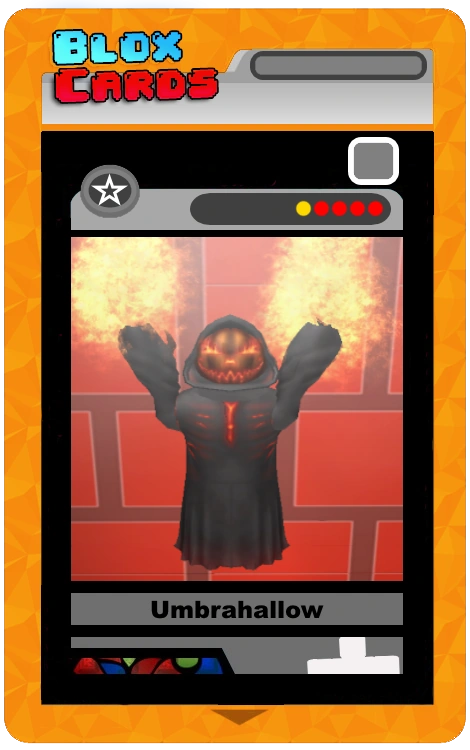
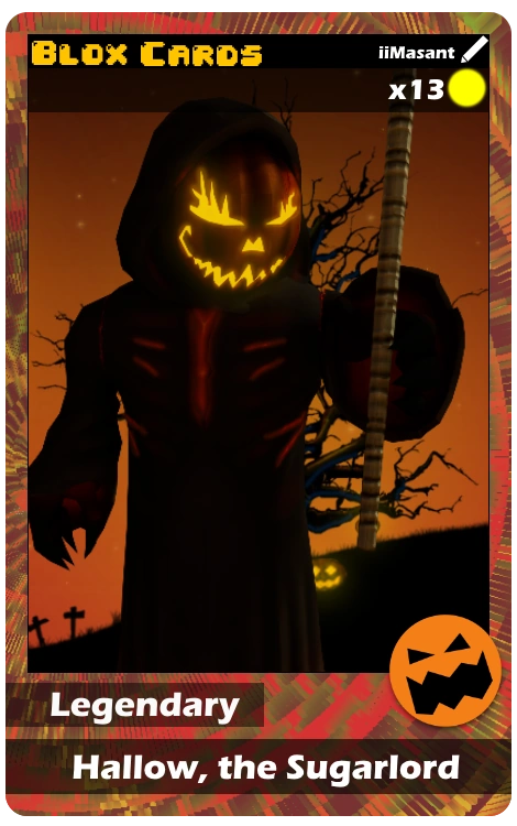
To explain this, see these two cards below. Both arts have the same avatar and are going for similar concepts. Which one represents Halloween more?


Most people would choose Hallow, The Sugarlord over Umbrahallow. Why is that?
Halloween is seen as the spooky holiday, so creepiness is a good factor when representing Halloween. The dead tree in the background, the graveyard, and the glowing jack-o-lantern in the background are iconic Halloween decorations, and are included. Meanwhile, Umbrahallow only has fire as its props, which isn't really seen as an icon for Halloween.
In addition, the color palette and lighting also goes into play. Hallow, the Sugarlord's art is dark and its main colors are orange and black, which fits the Halloween theme nicely. Meanwhile, Umbrahallow is bright from the fire, and doesn't have an outstanding color palette for Halloween.
Why is "Hallow, the Sugarlord" a good art, as opposed to Umbrahallow? It's not just representation of the art, emotion also plays a role. Hallow, the Sugarlord easily conveys its emotion of spookiness for Halloween.


How do card arts convey emotion? Lighting, color palette, and camera angle play a role on this. At times, background and props also play a good role on emotion.
Let's see this in action.
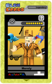
We have two examples; one of them being the official card art that is ingame. The other one is an unofficial art, made by a contributor of this game.
Both examples have similar poses and have a similar idea: expensive and rare props around Merely.
Blitzwolfer had asked a few people, mainly the people who work for the game and have a basic grasp on card arts, on what example best conveys emotion more. All of them have agreed on the second example.
Why is that? Let's compare each example.
The first example is an okay art. It has Merely reaching out the palm of his hand, while accessories float around him, mainly black and blue accessories. Overall, it's bland, but a simple art.
On the other hand, the second example has a similar pose. The only difference is that the head and right arm are lifted slightly up more.
In addition, the angle is changed to view more of Merely's face, and have the arm reach out to the front.
The accessories floating around Merely are more closer to Merely like they're orbiting. The accessories are more varying in terms of color and angle.
To seal the deal, the lighting and sparkles behind him makes the art look "shiny" and "glimmering".
Combine all of these positions and additions, and you make Merely look dignified, rich, important, and famous.
Showing emotion can turn an "okay" art to a "good" art.
In conclusion, representation is an important factor. This goes especially for players who want commissions, since they had paid at least 1750+ ROBUX on said card commission. They want to see themselves in the card art. The more the card art represents them, the more they'll like it.
Appeal[]
The second factor is Appeal. Appeal means how much it attracts the user. You can imagine this as a player opening a pack, and noticing that card art the first thing they open it. In addition, appeal is how "clean" it looks. What does "clean" mean in a card art?
There are two things that make a card art "clean":
- How few errors there are, technical or concept-wise,
- How natural it is to look at.


Let's explain what errors are in a card art. Technical errors are errors that aren't part of the concept, and probably aren't intended. For example, background lines, parts clipping (overlapping each other), misplacement and the avatar holding/wielding something wrong, etc.
An example of a technical error is tankbomer's art. If you can see in the top right corner of the art, you can see a tiny part of a red wall on there. It wasn't supposed to be there, but it's there.
Concept-wise errors are errors that affect the concept and not the art itself. Though not as often as technical errors, concept-wise errors can range from misinformation on the concept, to the art's concept itself. For example, green shouldn't have guns because it's not flavorful, but some green cards include guns in their arts.
While most errors aren't that easy to notice, it's important to fix these mistakes and be aware of any errors that may come up.

Now to talk about how to make a card art look natural. By this, we mean "Would it be good to look at?". Not by the art itself, but if it's not too bright or too dark, or it wouldn't make your eyes bleed just by looking at it.
When asking for criticism on your art, some people would complain on how the colors look too bright or the lighting is too dark you can barely even see it. While this isn't a big issue, it's important to go easy on the eyes for the viewers looking at the art.
However, take note that appeal should not be over-prioritized, and should be considered during the final stages of making a card art.
Number Three: The Art Fits the Border[]
It's common for a new artist to try to put everything in one small space, but it's important not to add a lot of stuff. Less is more. You shouldn't add more because:
- You would need to explain the extra stuff you're adding and fit them in the situation, while also being relevant to the concept.
- It would cause clutter.


Now, back to the topic. It's important for the card art to actually fit onto the border. Your space should generally be a square, if not, a scale of 1.25 x 1 as your dimensions. Having important stuff be cropped out of your art because it couldn't fit onto the border would mess with a card art's resonance and representation, and possibly appeal.
One Thousand Deaths made the mistake of missing this criteria. The original art was very wide, around 1500 x 500. However, because most of the stuff couldn't fit in the border, it was cropped out. Because of this, you don't know what's actually happening in the card art, which ruins resonance.
Be aware of the card border and how much space you have. If not, you'd have to do a lot of editing and revising to your card art after, as opposed to being aware of the card border earlier.
When we get new borders, your art will want to be about 470 x 700.
Number Four: The Art Looks Good When Zoomed Out[]
Some arts look very good up close, but very bad when zoomed out. Now you may be wondering, "Why should the art look good when zoomed out?"
This is because the card art with the border will look smaller, both with the border and ingame; as opposed to the card art without the border.
This will become less of an issue with the new borders.
Number Five: The Art Clearly Shows What Color the Card Is[]


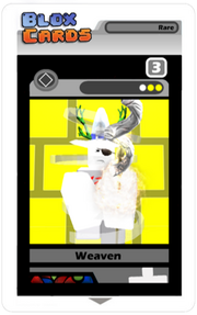


Regular_Talkshow was a card that didn't follow this rule. Judging by the card art alone, what do you think the intended color of the card is?
Some people would say red because of the brown-red mixture in the background. Others would say white because its avatar has its color white as the majority. However, this card is a blue card.
How would you even tell this card was a blue card? You can't.
This is why showing the color of the card from the art alone is important. Let's say they were opening up an Obvious pack, and collected a new card. They should instantly know what the color is from the art alone instead of thinking, "What color is this card?".
How about a newbie fighting a professional, and had played a card that they never seen before. If they can't understand the card's intended color from the card art alone, it will confuse said newbie.
This is why the art clearly showing its intended color is important. Having a card art that doesn't show its color well will confuse other players.
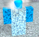
To fix this problem in your art, the most easiest and reliable option is to change the background's color. As you can see, the majority of said card background is now blue. Hence, you can easily tell that this card is a blue card, and generates blue icons.

There's also another option, but not so reliable, depending on the avatar/concept you're basing around with. You can also make the color of the avatar clearly show its intended color.
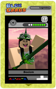
An example of this is Beeism's art. Beeism's art has a pink sky in the background as opposed to the basic green brick wall. However, you can still easily see that this card is a green card. Why? The avatar.
As you can see, most of the color in Beeism's outfit is green. Most people would safely assume that this would be a green card.
However, if you are going to use the avatar as a way to show the card art's intended color, please be aware of the avatar's color palette. If the majority color of the avatar conflicts with your intended card color, don't try this option.
Final Tips[]
Starting Off[]
If you're starting off your FIRST art, it's important to start simple. Don't try to make things overly complex for you, even if it means making an awesome art.
Truth is, you'd need to get comfortable with the modeling tools and angling, as well as lighting. Even if you THINK you are good at modeling when you start, stick to your comfort zone. When you're ready, you can go deeper into complex things, such as particles, skyboxes, fog, ambient, etc.
When you start off, start off simple.
Criticism[]
First off, all art can be improved. No matter how much you try to perfect it, it can still be improved, even in ways that this guide doesn't mention.
It's important to gain and acknowledge criticism. Whether it's nonconstructive criticism like "Your art sucks" to very specific and constructive criticism from one of the most experienced artists working for the game, it's important to acknowledge all of them.
Sure, you may disagree with some criticisms against your art, but that's okay. So long that it doesn't conflict with the criteria in this guide, of course. However, acknowledging the criticism is better than ignoring it.
Generally, art can't improve without criticism. Get as many people as you can to critique your art. Discord is a good way to get some criticism, since most Blox Cards contributors and artists are active there.
A good tip to follow by, when it comes to editing your art based on criticism, is to post your progress on the art. It'll be much easier on you, since you can easily make edits on the card art when you're making it rather than posting a "complete" art of it.
Particle Effects[]


Now particle effects can either make a card art insanely good, or downright terrible. If you do not know how to used ColorSequence/Numbersequence then I highly advise you learn how to use those, but here is what separates good particle usage and bad particles usage.
Bad particle usage:
- Uses the default particle texture WITH SOME EXCEPTIONS,
- clips through the body, not unique at all,
- has either stupid usage of color, size or transparency.
Good particle usage:
- Unique design through the size,
- transparency and color, Doesn't overflow the screen,
- more calm or cool to look at, works with the scene.
Advanced Art Techniques[]
Want to improve more as a card artist? See Blitz's Declassified Art Survival Guide!